

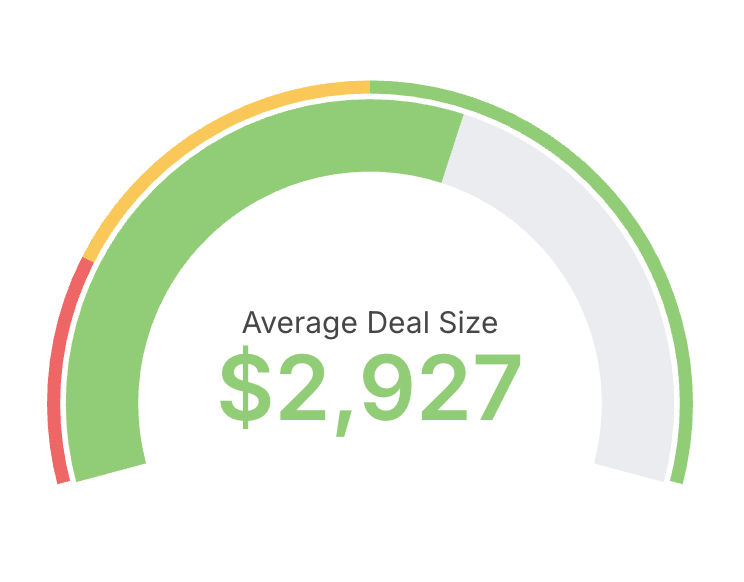
- Choose a single metric as the value to display.
- Optionally define min and max bounds for the scale.
- Configure colored ranges to communicate thresholds (for example: red, amber, green bands).
- Use gauges sparingly and for monitoring, not detailed analysis.
- Prefer descriptive labels and units so the value is immediately clear to viewers.
Referencing the active granularity in labels
The custom value and percentage labels accept the${table_field.granularity} placeholder to show the active date granularity — set it in Display configuration under Custom label. See Referencing the granularity in chart labels for the full syntax and supported labels.